

 Make a Mark
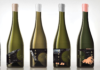
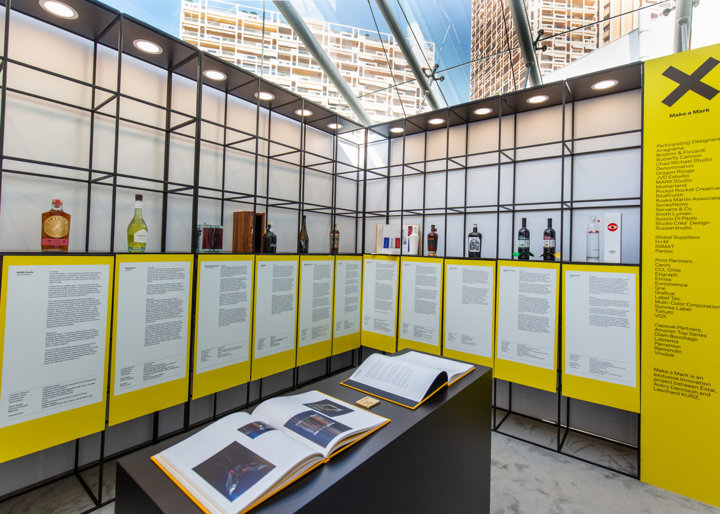
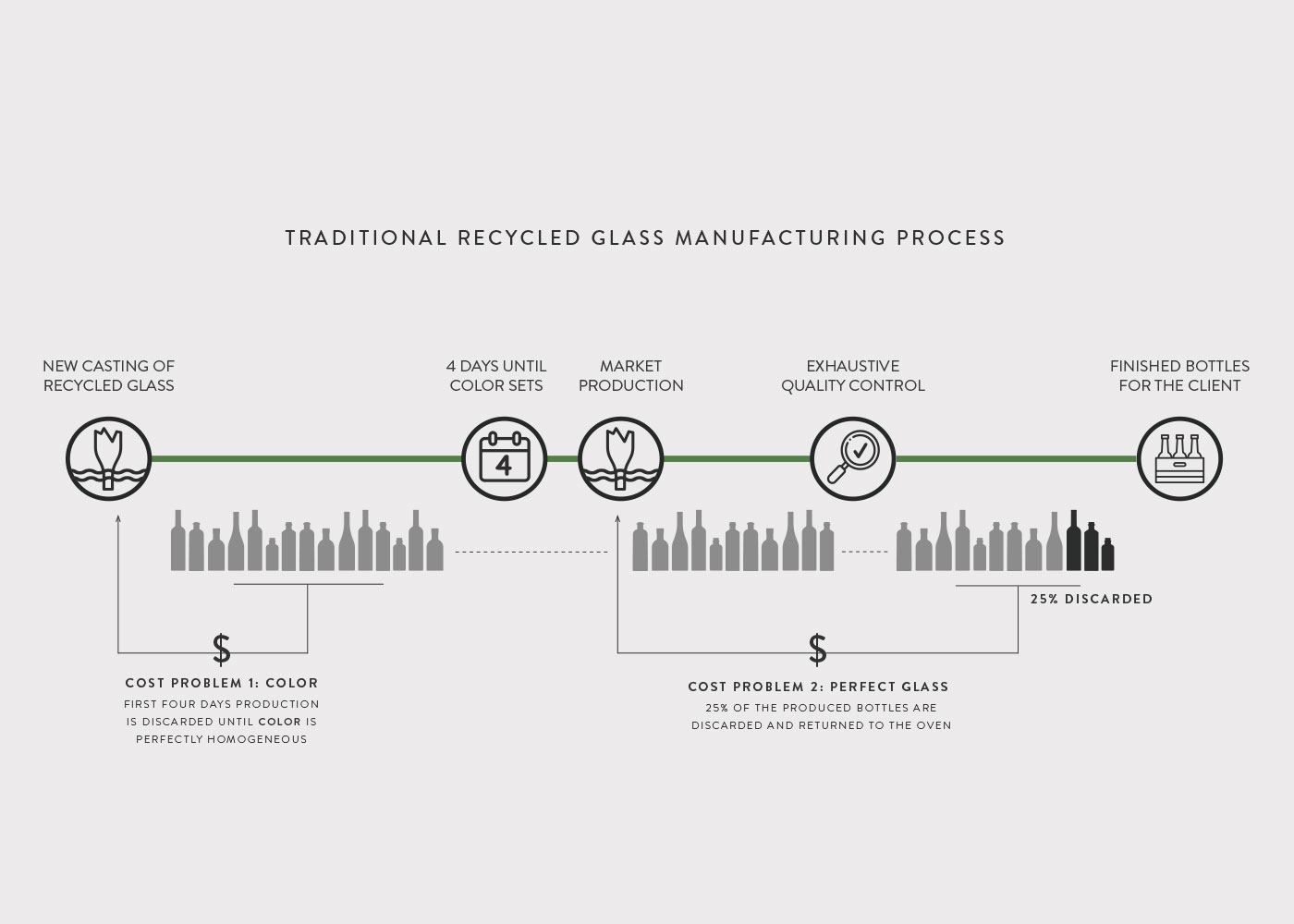
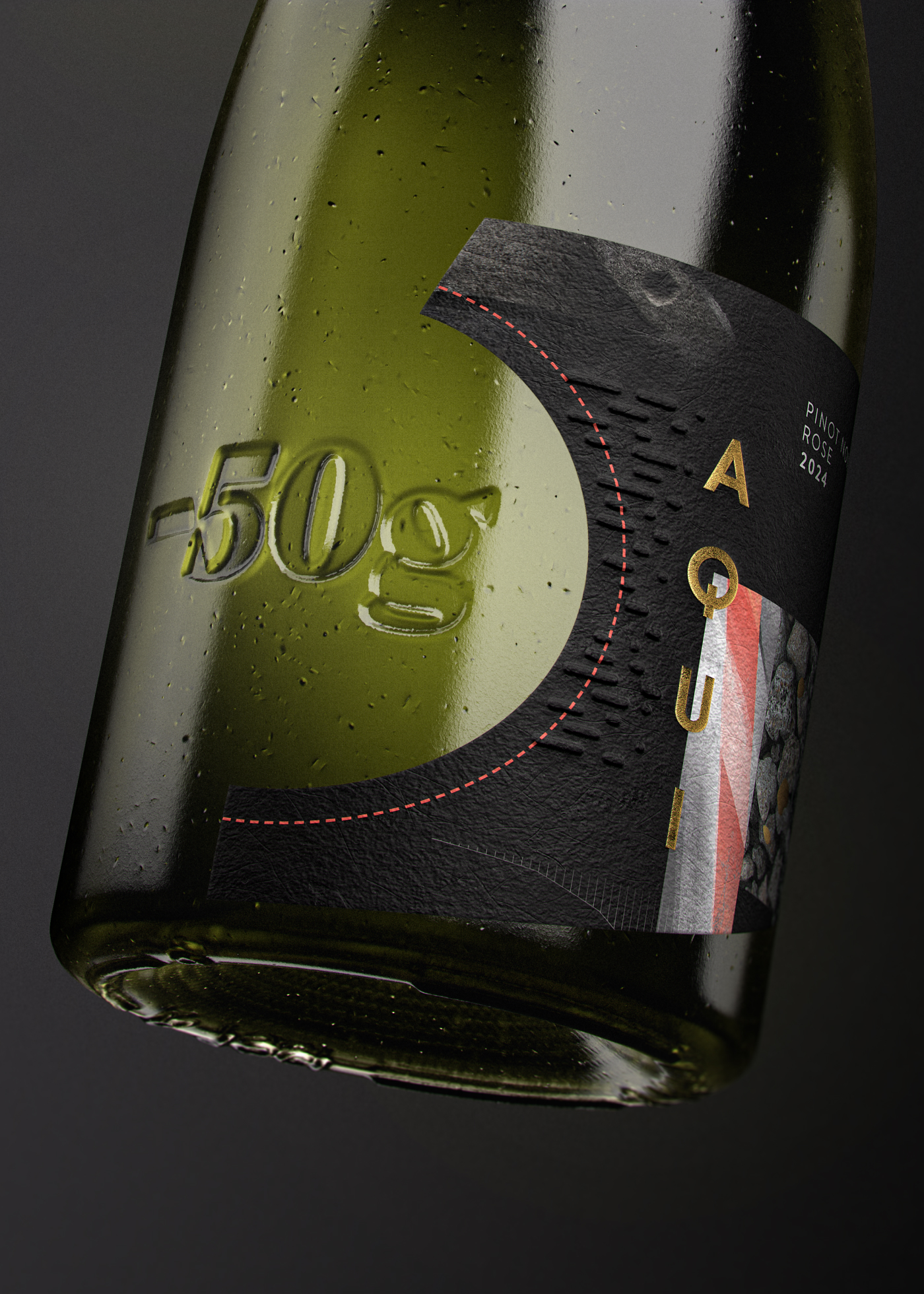
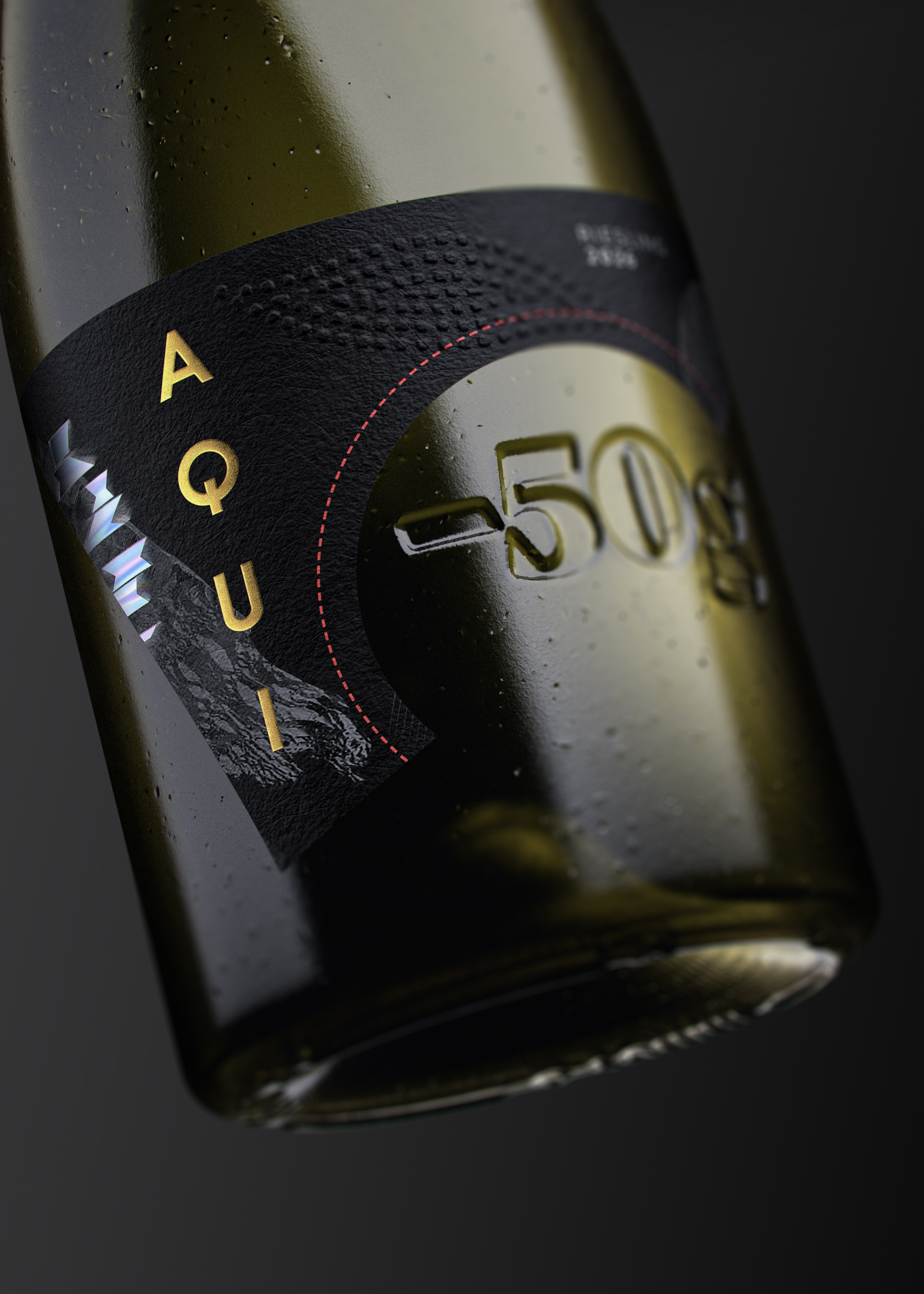
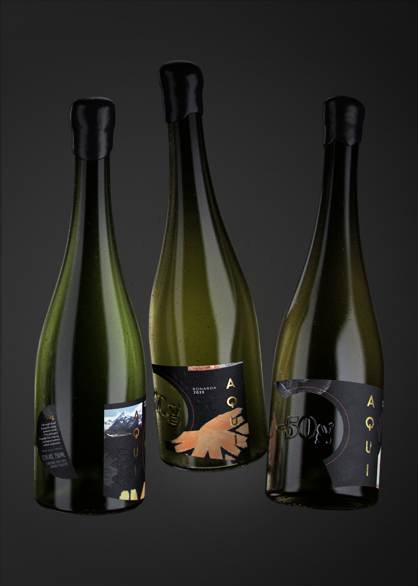
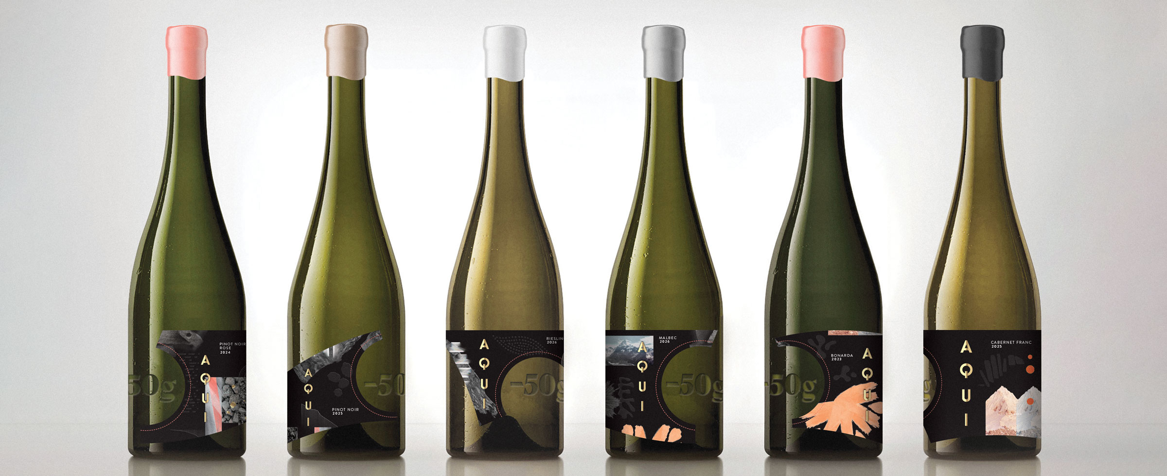
KURZ, ESTAL and AVERY DENNISON came together wanting to show the magic that happens when all parties in the chain work together. And establish a dynamic community of creative thinkers and rebels – all united by a love for glass, labelling, embellishment and packaging, and the desire to create new things. Make a Mark is about exploring creative boundaries and bringing even the most outlandish ideas to life, without the limitations of the day-to-day. For the project, 18 leading design agencies received a briefing focused on sustainability, luxury and innovation in the wine and spirits packaging industry. The final designs were presented at Luxepack Monaco 2021 as well as featured in a specially produced book for the event.
![]()
![]()
![]()
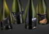
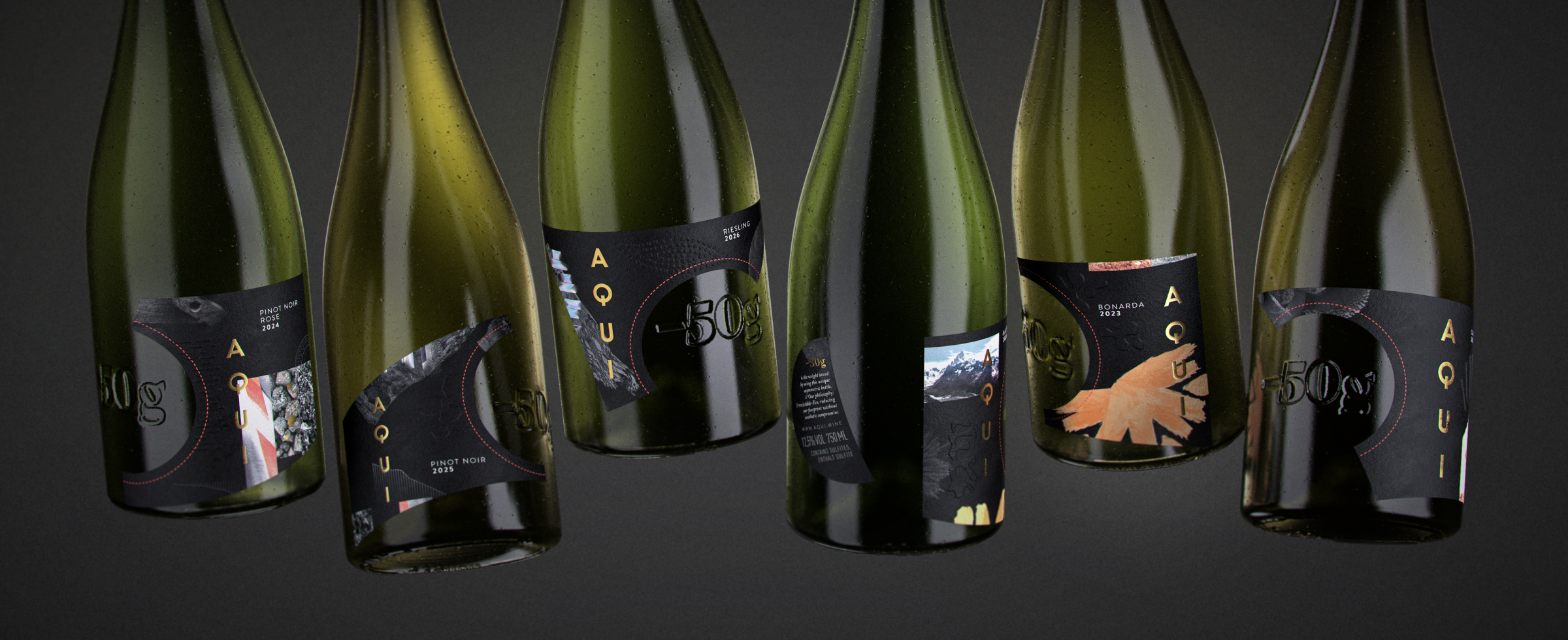